Your plan as a spreadsheet
Every chart in this series is a summary of the same underlying table. Sooner or later you will want to see the table — usually because a chart did something you did not expect and you want to find out which number moved.
What is in it
One row per projection year. Columns for each person’s age, household gross income, income tax, after-tax income, each benefit, and — the part charts cannot show — a balance and a withdrawal column for every account separately.
Columns can also be hidden manually and reordered by dragging, and both preferences persist. On a thirty-eight-year plan with two people and six account types, being able to strip it down to four columns is what makes it readable.
The toggle that matters
Every figure defaults to today’s dollars, consistent with the rest of the projection. The ledger can restate the whole table in future dollars — inflating each year by 2.1% compounded from the start year — which is useful for exactly one purpose: comparing against a statement or a pension projection that quotes nominal figures.
It is the same wealth either way, as episode 38 laid out. Having both conventions available in one place is what stops the comparison being done by hand and wrongly.
Thirty-eight rows
Dan & Marie — 58 and 56, Alberta. Dan retires at 62 with a defined-benefit pension; Marie retires at 60. Their RRSPs are very different sizes, which matters later.
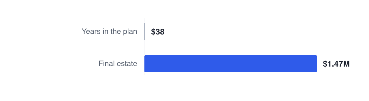
Dan and Marie’s plan starts at 58 and 56 and runs to Marie’s life expectancy of 93 — thirty-eight rows, ending at $1,747,650. Every figure quoted in any of their episodes is a cell in that table.
The practical use is diagnostic. A net worth curve that dips oddly in one year is explained by finding that row and reading across it — which account was drawn, what the tax was, whether a goal fired. The chart raises the question; the row answers it.
Getting it out
The table exports to CSV and to a spreadsheet file, honouring the visible columns, the column order and the dollar convention you have selected. Which matters for two reasons: you may want to do arithmetic the tool does not do, and you may want to hand the numbers to an accountant who works in a spreadsheet.
One deliberate gap worth knowing: there are no per-account contribution columns, because the projection does not currently report contributions per account. Balances and withdrawals are there; deposits are visible only as the balance change. Better an absent column than an inferred one.
Two small conveniences make a long table usable. Retirement years are highlighted per person, so the point each of you stops working is findable without counting rows. And the header row and the leading identity columns stay pinned while you scroll, which on a table forty columns wide is the difference between reading it and getting lost in it.
The ledger view shows the whole projection as a table with column control, the today’s-versus-future dollar toggle, and export — and clicking a year from any chart jumps straight to that row.
Next: estate basics — probate, deemed disposition, and the final return.
GlidePathEngine is an educational planning tool — not financial, investment, tax, or legal advice.