Reading the cash flow chart
The net worth chart tells you how much you have. The cash flow chart tells you how the spending is actually being produced each year — which is the question a retirement plan is really answering.
What is on it
Income arrives as stacked bars, one segment per source, so the height of the stack is the household’s total income for that year and each segment shows where it came from. Withdrawals from accounts are separated from benefits and from employment income, because they behave completely differently.
Against that, lines and separate series show what the income is for: the retirement income target, insurance premiums, goal expenses and care costs, each labelled individually rather than blended into one number.
The gap that matters most
The window between the last salary and the first benefit is the low-income period referenced throughout this series — the meltdown window, the gain-harvesting window, the cheap-conversion window. On this chart it is immediately visible as a stretch where the income stack is short and made almost entirely of withdrawals.
The second thing to look for is a year where the stack suddenly grows without the spending line moving. That is forced income — the schedule producing more than the plan needs, which is episode 55’s surplus problem showing up as a visual.
One year, decomposed
Dan & Marie — 58 and 56, Alberta. Dan retires at 62 with a defined-benefit pension; Marie retires at 60. Their RRSPs are very different sizes, which matters later.
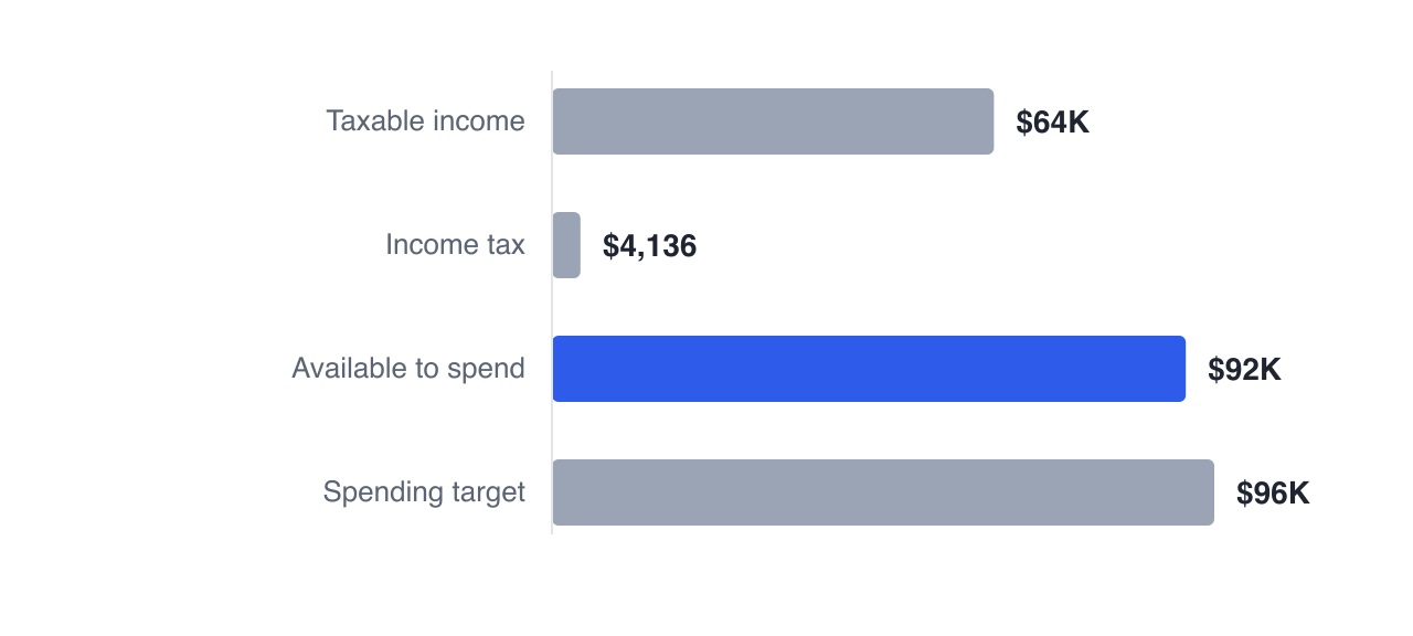
In the year Dan turns 65 the household’s gross income is $65,091, income tax is $3,854, and $92,146 is available against a $96,000 spending target.
Notice that the available amount exceeds the gross figure. That is not an error — tax-free receipts like TFSA withdrawals are spendable income and are deliberately not in the taxable total. A chart that showed only taxable income would understate what the household actually has.
Later in their plan the picture changes character. Dan’s pension contributes $38,000 and the mandatory withdrawal adds $46,856 at 72, so the taxable stack rises sharply while the spending line stays flat. That divergence is the whole story of their later years, and it is visible at a glance.
Two things worth clicking
The tooltip breaks account withdrawals down per account, so you can see whether a year is being funded from the TFSA or the RRSP — which is the drawdown-order decision from episode 22, made visible year by year.
And clicking a year replaces the chart with that year in detail: every income source, the tax, and what funded the spending. It is the fastest way to answer "why is that year strange", which is usually the question a chart raises rather than settles.
One presentation decision worth knowing about. The chart deliberately separates goal expenses, insurance premiums and care costs from the base retirement-income line rather than bundling them, because a purchase year would otherwise appear as a spike in "income" and a spike in spending simultaneously — the same dollars counted twice in a reader’s head. Separate series make a one-off expense read as what it is.
The cash flow view stacks your income by source against your spending target for every year, and clicking any year opens it in full detail.
Next: following every dollar — the Sankey view.
GlidePathEngine is an educational planning tool — not financial, investment, tax, or legal advice.