Reading the net worth chart
The net worth chart is the first thing anyone looks at, and the most commonly misread. A line that goes down is not a failing plan. A line that never goes down is usually a plan that is leaving something on the table.
The shape a working plan makes
A retirement projection produces a curve with three distinct phases, and each one is telling you something different.
- The climb. While you are working, contributions and growth both push in the same direction. The slope here is steeper than growth alone.
- The peak. The year you stop working. Contributions end, withdrawals begin, and the curve turns over. Where this peak sits is the single clearest read on your retirement date.
- The decline. Withdrawals now exceed growth. This is the plan doing its job — converting savings into the retirement it was accumulated for.
Priya’s curve, and its three phases
Priya — 54, Ontario, single. $118,000 salary, $410,000 in her RRSP and $88,000 in her TFSA, planning to retire at 63.
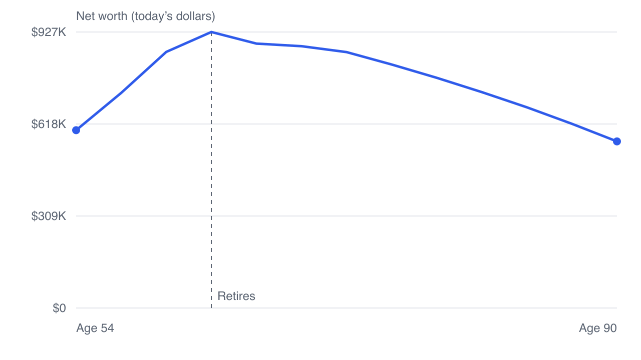
Priya peaks at $917,791 around age 62, then declines for nearly thirty years. The decline is gentle — she is not draining the portfolio, she is spending roughly what it produces plus a little more. A much steeper decline would be a signal; this one is not.
Notice too that the curve does not fall off a cliff at 72 when mandatory RRIF withdrawals begin. Forced withdrawals move money *between* accounts and generate a tax bill; they do not by themselves destroy net worth. What they do is raise taxable income, which is a different chart.
The drop at the very end
Priya's net worth in her final year is $515,406. Her estate — what actually reaches her beneficiaries — is $399,597. The gap of about $115,809 is not a modelling error. It is the tax the estate itself triggers.
At death, Canada treats you as having sold everything you own at fair market value, and the entire remaining balance of an RRSP or RRIF is included as income on a final return. For someone with a large registered balance, that final return can be the highest-income year of their life, taxed accordingly.
That is why net worth and estate value are different lines, and why a plan optimised to maximise one does not necessarily maximise the other. Track 6 of this series is entirely about that gap.
What a curve in trouble looks like
A declining line is normal. There are three shapes that are not, and they are worth recognising because each points at a different fix.
- It reaches zero before the plan ends. The most direct signal there is: the money runs out while the person is still alive. The year it touches zero tells you how much slack you are working with — reaching zero at 88 is a different problem from reaching it at 72.
- It falls steeply and immediately after the peak. Early withdrawals far larger than the portfolio can sustain. Because those first years compound against everything that follows, this shape is more dangerous than the same withdrawals taken later — which is sequence risk, and it gets its own episode.
- It barely rises before the peak. Contributions are being outrun by something — fees, a return assumption that is doing no work, or spending that never left room to save. This one is diagnosed before retirement, where it is still fixable.
None of these is visible from a single balance. They are visible from the shape, which is the argument for looking at the whole line rather than the number at the end of it.
What the chart deliberately does not tell you
- Whether the money is spendable. Home equity is in net worth and is not available to buy groceries. This is why retirement readiness is measured on income, not net worth.
- How much of it is yours. An RRSP balance includes the government’s future share. Two plans with identical curves can differ substantially in what they actually deliver.
- What happens if returns are not average. A single line is one path. The order the returns arrive in matters enormously, which is what a Monte Carlo simulation exists to show.
Click any year on the net worth chart to open that year in detail — what came in, what went out, and why the line moved the way it did.
Next: how much should you actually be saving — worked backwards from the answer instead of guessed as a percentage.
GlidePathEngine is an educational planning tool — not financial, investment, tax, or legal advice.