Following every dollar: the Sankey view
A bar chart shows how much. A flow diagram shows the path each dollar takes — which source it came from, whether it passed through the tax system, and what it ended up paying for. For one year at a time, that is a different and sometimes more useful picture.
How to read it
Sources are on the left, destinations on the right, and the width of each band is the amount. A wide band is a lot of money; a thin one is not. Nothing else in the diagram encodes value, which is what makes it readable at a glance.
The bypass is worth pausing on. It is the clearest possible illustration of why a TFSA withdrawal is different in kind rather than degree — it never touches the node where clawbacks and brackets are decided.
Why it must balance
A Sankey diagram cannot lose money. Every dollar entering on the left leaves on the right, and if it did not, the diagram would visibly fail to close. That makes it a good consistency check on a projection — and it is why the terminal node has to be labelled carefully.
In a household where both people are retired, the terminal is retirement income. Where nobody is retired yet, it is spending and savings. Where exactly one person is retired the diagram splits into two proportional terminals, because calling a working spouse’s salary "retirement income" would be wrong — and quietly wrong, which is worse.
One year as a flow
Dan & Marie — 58 and 56, Alberta. Dan retires at 62 with a defined-benefit pension; Marie retires at 60. Their RRSPs are very different sizes, which matters later.
In their age-65 year, $65,091 flows through the gross income node, $3,854 branches off to tax, and the remainder joins the tax-free flows to reach $92,146 of net income.
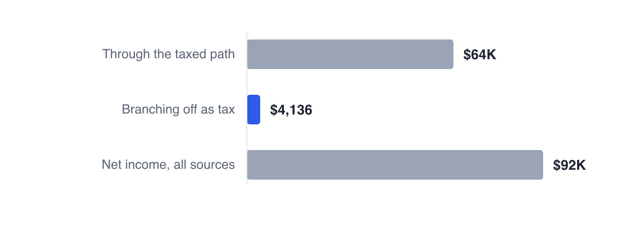
The tax band being narrow relative to the flow is the visual signature of a well-sequenced year — plenty of income, little of it taxed heavily. In a year with a large mandatory withdrawal the tax band widens noticeably, and no arithmetic is required to notice.
What it is best for
Two things. Understanding structure — which sources dominate, how much passes through the tax node, how much bypasses it — in a way a stacked bar cannot show, because a bar chart has no way to draw the tax step at all.
And explaining a plan to someone else. A flow diagram of a single year is the most legible representation of a retirement plan for a person who has never looked at one, which makes it the right picture for a conversation with a spouse or an adult child.
The cash flow view toggles between the bar chart and the Sankey, with a selector for which year to trace — so you can pick the year you find puzzling and follow the money through it.
Next: your whole plan as a spreadsheet, one row per year.
GlidePathEngine is an educational planning tool — not financial, investment, tax, or legal advice.